Posted on Leave a comment

Abstract Shades of Gray

Exercise in Collage Interpretation in Acrylics – Black to White

What a joy to spend an evening with my grown up children, watching them create with teaching artist, Colin Molaski!  My daughter flew in from Las Vegas for a visit before leaving for Brazil for the holidays.  She is co-owner of Refind Creations and it’s always great to have her in the studio! 

My son lives locally and both are amazingly talented artists.  They joined Colin’s class in Acrylic Abstractions and had a wonderful time!  If I wasn’t in medical imaging where I create beautiful images every day, I would likely be a black and white photographer, so the technique of this class really resonated with me.

Colin says this is the number one exercise for thinking about composition.  It will force you ask visual questions, stay engaged, and focus on creativity in a whole new way.  Is it touching the edge? Does it have energy? How does it flow?  This is all about timeless elements and engaging.  Not too busy, not too boring.

These techniques can be used for the rest of your life as you build your creative tool kit! 

Colin recommends that if you are struggling to get started on your next project, take random things around the house, build a 3D sculpture, and try to paint or sketch that.  This lets your mind loosen up and start to feel creativity flow.

So, what exactly are the steps for this very creative process?

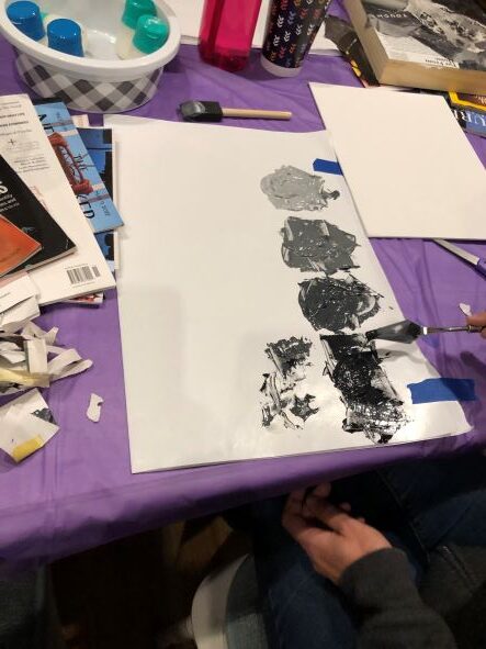
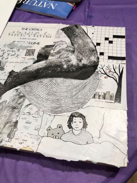
Step 1 – Tear or cut out pieces from magazines that are black and white – 15 to 20 pieces.  All shapes and textures; all kinds of words or shapes.  Spend no more than 20 minutes doing this.

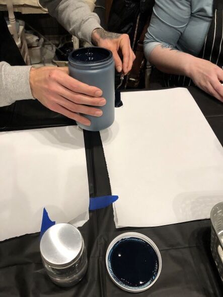
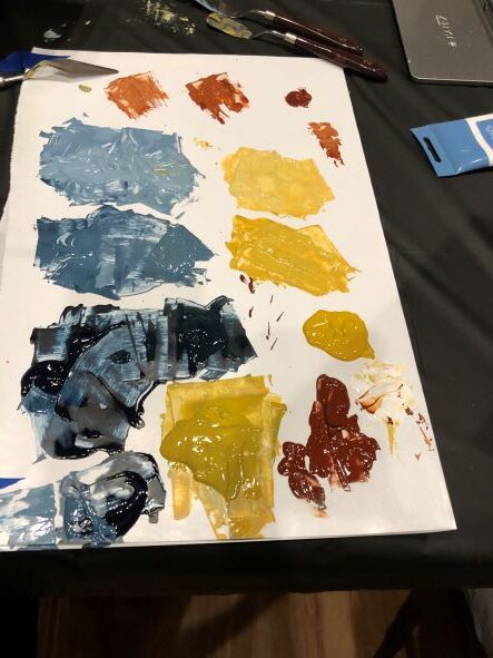
Step 2 – Put Black, white and yellow ochre acrylics on your palette

Mix your palette – dividing into dark, medium, light and very light.  You will be training your eye to see the varied values.  Add white to the black to make shades of gray.  Add yellow ochre to the shades of gray to create a warm palette to compliment the cooler grays.

Step 3 – Cover your entire background (cardboard, wood crate canvas or whatever substrate you like) with 8 pieces of your magazine sections.  Leave nothing showing.

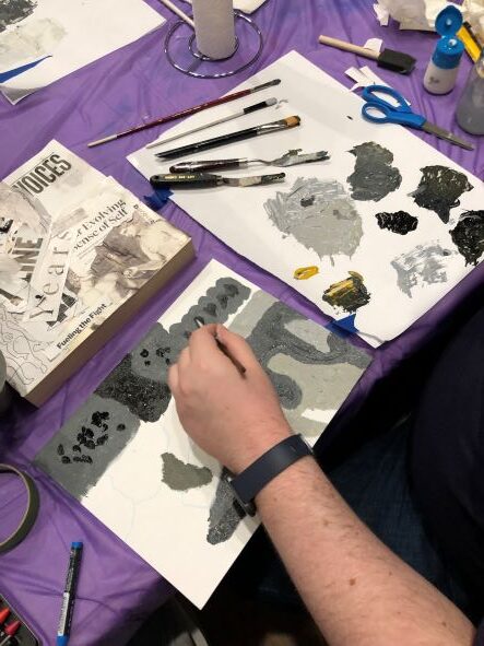
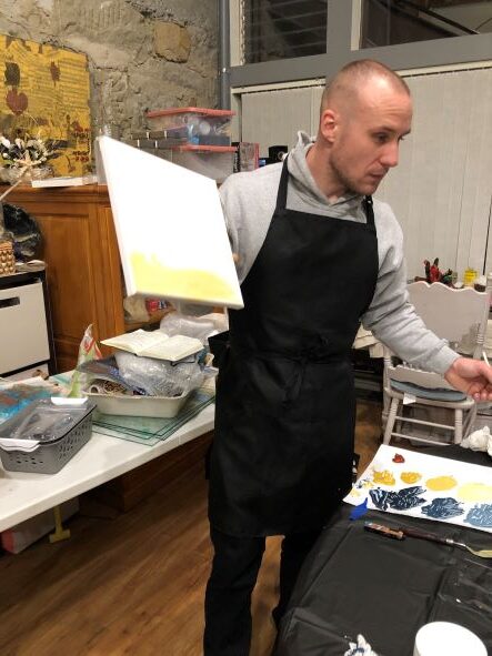
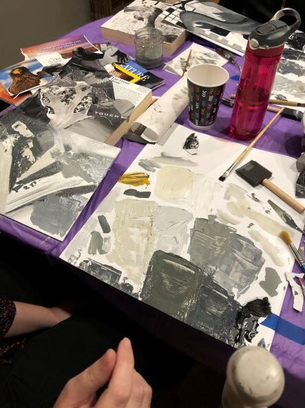
Step 4 – Observing your collage, choose shapes and angles you see to sketch a guide on a canvas board

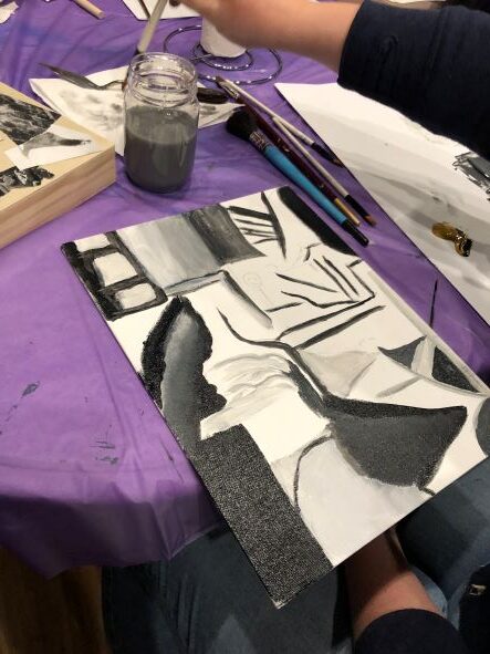
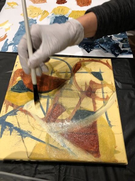
Once you start blocking the shapes and turning the canvas, you’ll find the moment where the magic happens!  You’ll forget to focus on the task at hand and create. Free up your mind and let your creativity begin to flow.  Add lines, change shapes, and let your eye decide if you are excited or if you hate it. Don’t be afraid to throw in a streak of white, a line of black.  Use your palette knife to spread, scrape, and change the direction. Scrape mid tone over a dark tone to create depth.  If you cover the line, reintroduce it!  Be fearless.

Step 5 – Once you have a good basis, just ignore the collage and start responding to the painting itself. 

  • Supplies:
  • Magazines
  • Black, White and Yellow Ochre Acrylic Paint
  • Cardboard
  • Canvas Board
  • Glue
  • Palette Knife
  • Brushes

Each artist came up with beautiful designs and the process evoked emotion, frustration, re-focusing, and creating.

Enjoy their beautiful masterpieces!

Posted on 1 Comment

Payne’s Gray Anchors A Beautiful Palette

In our life there is a single color, as on an artist’s palette, which provides the meaning of life and art. It is the color of love.

Marc Chagall

Have you heard of Payne and why it is one of the most prolifically used colors in acrylics? What is your “go to” color when you are creating? Payne’s Gray has been around for hundreds of years and is still the anchor to an artist’s palette.

Guest Artist Colin Molaski is enthusiastic and loves acrylic paint like you might love, say, chocolate!

Colin is prepping the canvas so the white isn’t so intimidating – good way to start your process!

The Acrylic Abstractions class used a limited palette to create an unique, abstract masterpiece. To get started, Colin placed a soothing dollop of Titanium White, Payne’s Gray, Yellow Ochre, and Burnt Sienna onto a piece of butcher paper.

Yellow Ochre consists mostly of clay colored by iron oxides. It is a very saturated color that can be toned down with a touch of Payne’s Gray. Yellow Ochre’s main coloring component is the mineral limonite. It has been in use as a pigment since prehistoric times.

Burnt Sienna is a deep rich brown clay. Sienna contains a high degree of iron oxide with varying amounts of clay and quartz.  In its natural state, it is yellowish brown and is called raw sienna. When heated, it becomes a reddish brown and is called burnt sienna.

For the lesson in abstractions, taking the Payne’s Gray and dividing into six shades by adding a little white, a little more white, and a little more white… then taking a little Yellow Ochre to create a cooler shade. A warmer shade. A darker shade. A lighter shade.

this “limited palette” was created using Payne’s Gray, Yellow Ochre and Burnt Sienna

Painting with Payne’s Gray is a magical experience for acrylics painters. It appears almost black but is actually a dark blue-gray color which artists use to mix in place of black to develop the right shades for a wider color scheme.

When watercolor artist William Payne developed this mixture in the late 1700’s, he used a combination of Prussian Blue, Yellow Ochre, and Crimson Lake. As time went by the combination changed to what is now ultramarine or phthalocyanine and black.

Colin says, “Payne’s Gray isn’t boring, it interacts with other colors to give feelings. It gives a more exciting primary color”.

After creating this beautiful combination of colors to work with it’s time to create a composition!

Square, Triangle and Circle. Draw a triangle, a square and a circle with two of the shapes moving off the edge of the canvas. Turn the canvas 45 degrees. Pick a color off your palette and do it again. Turn it 45 degrees and repeat until the fourth time. This is a jumping off point for the next step. Scrape the palette knife across and let it smudge the lines.

Contemplate the outcome and focus on the lines you’ve now created. Now it’s time to paint! Loosely fill in and create shapes with various colors. Just let the painting develop based on how you feel. Let yourself go and create shapes, ask questions about how the various shapes make you feel and re-evaluate your process.

Keep the line alive. Let your eye decide what is working and what it is making you feel. Add in more color, letting the darks and mid-tones interact with one another. If two dark colors get together then punch in a little light color.

The technique Colin used was found to be “very forgiving”. If the artists didn’t like what was happening they could just add a little white, pull a color through, turn the painting to get a new perspective, or add a new line. To get over the fear and anxiety of “where do I start”, do a wash on the canvas and then let the painting guide you by training your eye on composition, color combinations and values, and what excites you visually. Find a palette combination that makes you feel curious. Ask questions about your painting.

masterpiece in progress

List of supplies:

  • Acrylic Paint in Payne’s Gray, Yellow Ochre, Burnt Sienna, Titanium White
  • Palette knives in various shapes
  • Filbert brushes and flat brushes
  • Butcher paper
  • Water in a jar
  • Paper towels
  • Water based pencils
  • Stabilo Pencils

The very first abstract acrylics class was a big hit! If you want to learn how to “let go” with your creativity, consider joining us for an upcoming abstraction!